You shouldn’t judge a book by its cover, but people often do. Which is why publishers spend so much time and money getting the cover artwork designed. Book covers are an important marketing tool because if well designed, they will give a good indication of what the book is about.
A ‘pink and fluffy’ cover is unlikely to be crime fiction, whilst a cover portraying a dark, misty wood is more likely to be a thriller than a romance. However covers for the same books do change over the years (if they hang around for long enough).
Agatha Christie
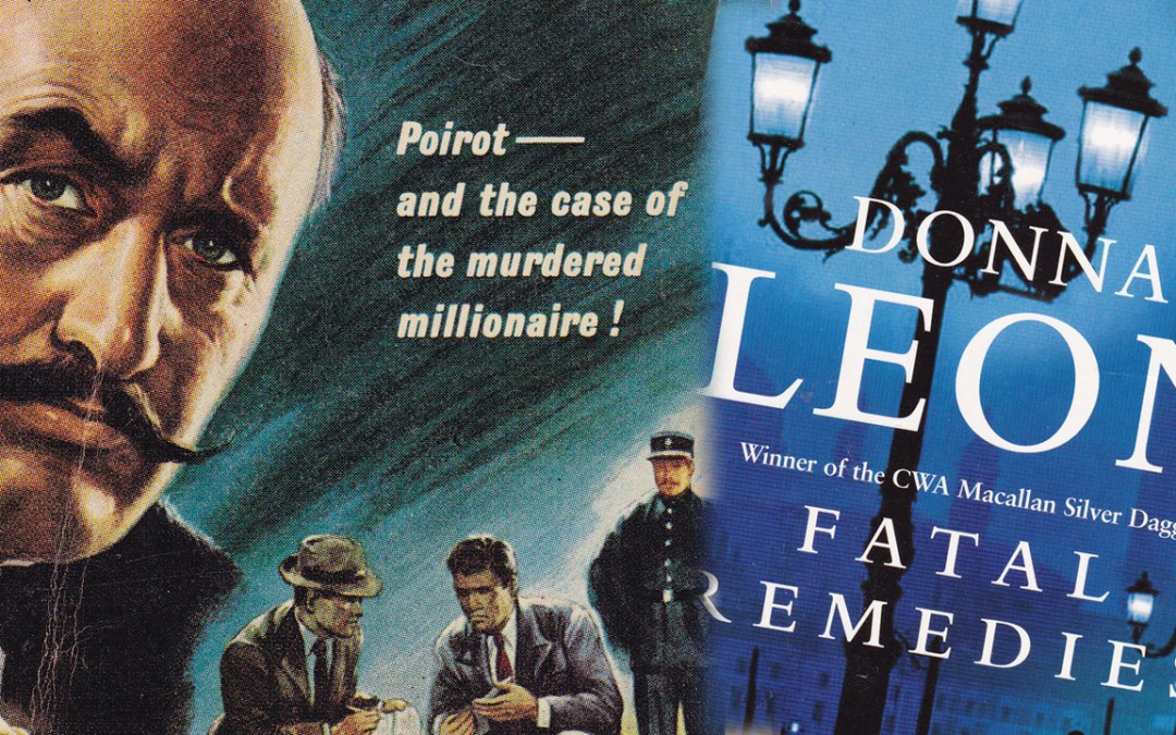
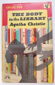
Take Agatha Christie for example; her books have had more artwork styles on the covers than I’ve had hot dinners, well almost. My favourite Agatha Christie cover artwork is the pulp fiction styles from the 1950’s and early 1960’s; over the top yes… melodramatic yes… but you really want to pick them up and read them. I love them!
I like the Tom Adams covers too, which dated from the late 1960’s right up to the early 1980’s. Adams put a lot of thought into his art; he read each book twice and then did a painting that captured what he saw as the essence of the story.
There have been some fairly dodgy Christie cover designs in the intervening years, in my opinion.
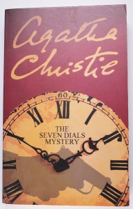
However, the Agatha Christie signature editions from the 2000’s are excellent. They’re retro in look and beautifully executed; for me they capture the style, wit and drama of Christie’s stories.
Book Cover Fashions
Generally speaking, books with bright neon-coloured spines and titles, on a black and white photographic image appear to be fashionable at the moment. This may be purely so that it stands out on the shelf, or may be intended to introduce a little shock value to express that an exciting storyline is contained within.
Book covers featuring shadowy silhouettes seem to be popular designs for Nordic Noir, Often these lonely figures are standing in misty landscapes, or snow scenes, some are shown near the edge of frozen forests. This is a great way to express the often bleak outlook of the detective protagonists and the dark, heartless nature of the crimes committed.
Close-up photographs of a woman’s face looking startled or afraid are also popular in the crime and thriller genre. Clearly these are intended to convey the tense and thrilling nature of the storyline within, although I’m not sure why only female characters are used. Good old fashioned sexism perhaps? Don’t they know that women read thrillers too?
Gloss used to be good, but now matte laminate is king. Cover artwork fashions come and go; some make me wince in horror, others make me chuckle, and some I absolutely adore and want to collect. They are always changing and always fascinating.
Good Book, Bad Book
When I’m faced with two different editions of the same crime book from a seller, I won’t always pick the newest edition, I will pick the one with my favourite artwork.
So whilst a good cover can’t make a bad book good, a good cover can make a good book even better.


